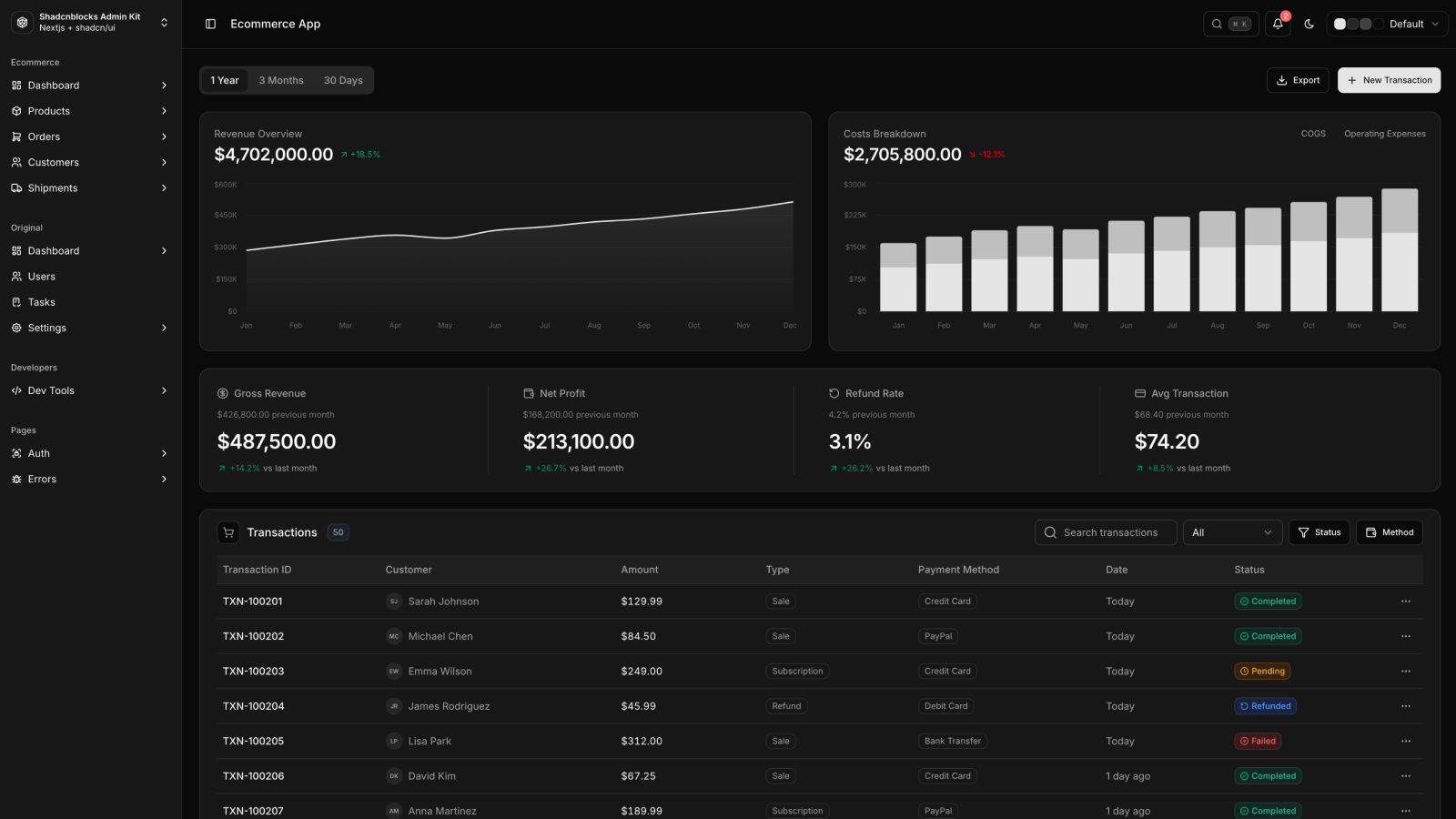
Studio for makers
Build something worth showing off.
A studio for founders, freelancers, and small teams shipping work that actually ships. We design, build, and stay close to the craft.

→ Tokens
Every section reads from these CSS custom properties. Change the
token, the whole site reflows. The agent sets them once via the
set_style_tokens tool.
--pagebot-color-primary
#ea580c
--pagebot-color-primary-fg
#ffffff
--pagebot-color-accent
#0ea5e9
--pagebot-color-accent-fg
#ffffff
--pagebot-color-bg
#fafaf9
--pagebot-color-fg
#1c1917
--pagebot-color-muted
#e7e5e4
--pagebot-color-muted-fg
#57534e
--pagebot-color-border
#e7e5e4
--pagebot-color-error
#dc2626
--pagebot-font-heading
'Inter', system-ui, -apple-system, Segoe UI, Roboto, sans-serif
--pagebot-font-body
'Inter', system-ui, -apple-system, Segoe UI, Roboto, sans-serif
--pagebot-radius
0.75rem
→ hero
A studio for founders, freelancers, and small teams shipping work that actually ships. We design, build, and stay close to the craft.
→ logo_strip
Trusted by
“They turned three months of pitch decks into a real product in six weeks. I would hire them again tomorrow.”
→ features
Three lanes, picked because we are good at them, not because the deck has a third bullet.
Identity, type, color, voice. Built to scale beyond a single launch.
From sketch to shipped. We sit in your Linear, your Figma, your Slack.
Astro, React, the platform. Fast pages, accessible by default.
The same component, swapped to image cells. Same grid, different texture.

Half-day workshops, in person or remote.

Embedded with your team for a quarter or more.

Two-week deep dives on a specific problem.
→ about

→ gallery
A selection, not the full archive. Ask if you want to see more.

Cafe Nord, identity & site.

Hearth & Co, product launch.

Brick House, brand refresh.

Northwind, micro-site.

Studio Faraday, packaging.

Klio, event brand.
→ contact
Form below is in demo mode here (POST to /api/inquire/0, server returns ok without inserting or DM-ing). On a real user page the action becomes /api/inquire/<userId> and DMs the owner via Telegram.
Tell me what you are building, what kind of help you need, and when you want it shipped. I read every message.
→ forms
Three shapes the platform supports. All three POST as JSON to
/api/inquire/0
(no-op route — validation runs, nothing persists). Inline errors
appear under each invalid field; the form swaps to a thank-you
card on success.
Minimal
Newsletter (email only)
Full inquiry (mit Dropdown)
→ media_placeholder
Used when a section has an image slot but no content-relevant image. Stripe pattern + small label, theme-aware.
→ custom_html
Escape hatch for niche layouts. raw_html is sanitized server-side (strip script/iframe/on*-handlers/javascript:). raw_css is scoped to the section wrapper.
This entire block came from a single tool call with raw_html + raw_css.
Built with preview.style →→ built_with
Watermark pill shown on every unpaid site. Bottom-right, theme-neutral white pill. Wires to user_sessions.status === "paid" in Phase 4.
28 shadcnblocks pre-installed and renderable via
shadcn_block sections. Anchor URLs like
/styles#hero45 jump straight to a block.
↘ navbar
Horizontal navbar with icon dropdowns, signup/login buttons, mobile sheet with accordion submenus
Compact navbar with two-column features dropdown, plain text links, sign-in + CTA, mobile top-sheet
Wide navbar with solutions + platform mega-dropdowns, glassy sticky behavior, mobile drawer
↘ hero
Centered hero with rating row under single CTA, overlapped avatars + star score
Finely crafted components built with React, Tailwind and Shadcn UI. Developers can copy and paste these blocks directly into their project.
from 200+ reviews
Two-column hero on muted panel with right-side bleed photograph, anchor buttons
Changelog v1.1
Finely crafted components built with React, Tailwind and shadcn/ui. Developers can copy and paste these blocks directly into their project.
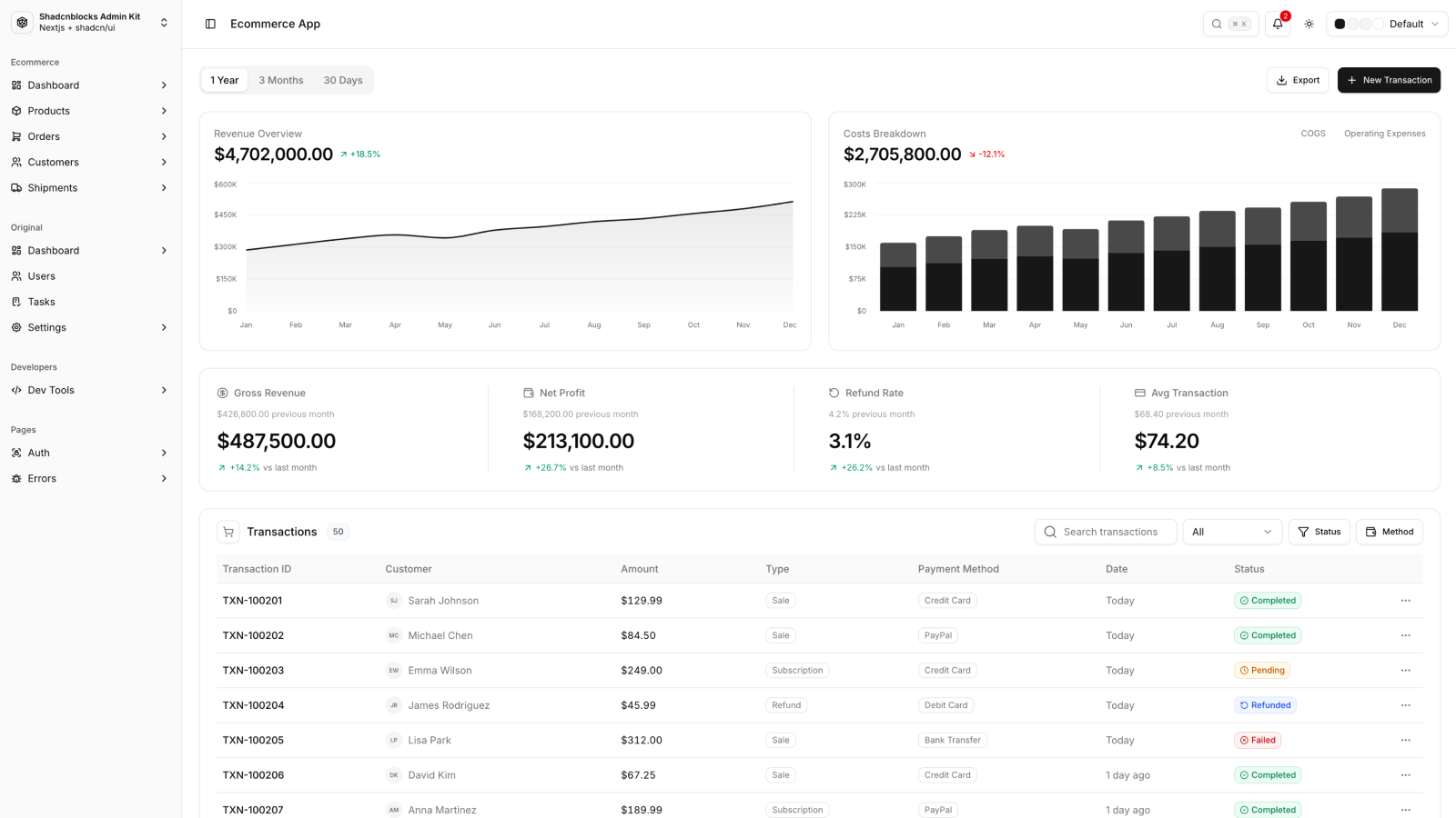
Hero with wide image that crossfades between three feature columns on hover [animated]
Hero with left copy column and right accent-tiled feature card grid, badge + CTAs

Centered hero with concentric-ring backdrop decoration, icon + headline + single CTA
Finely crafted components built with React, Tailwind and shadcn/ui. Developers can copy and paste these blocks directly into their project.
Hero with tabbed dashboard preview, animated border beam, dashed ornamental frame [animated]
↘ features
Centered title above six circular icon tiles in 3 columns, ending with a primary CTA
Every block ships as plain React you own. No runtime dependency, no SDK lock-in, just copy and customize.
Every block adapts seamlessly from mobile to desktop with Tailwind's mobile-first utility classes.
Built on Radix UI primitives with proper ARIA attributes, keyboard navigation, and focus management.
Fully typed props and interfaces so your editor catches issues before they reach production.
Override any prop, swap icons, adjust spacing — every block is designed to be extended, not locked down.
Battle-tested in real projects. No placeholder hacks, no lorem ipsum — clean code you can ship today.
Tabbed feature showcase with switching content panels for product walk-throughs
Join us to build flawless web solutions.
Discover new web trends that help you craft sleek, highly functional sites that drive traffic and convert leads into customers.

Feature grid with split header copy and a six-card layout with icons + descriptions
Streamline is built on the habits that make the best product teams successful: staying focused, moving quickly, and always aiming for high-quality work.
↘ logos
Logo carousel with auto-scroll, responsive column count, fade gradients on edges [animated]
↘ pricing
Three-tier pricing cards with feature lists, highlighted middle tier, primary CTA per plan
Check out our affordable pricing plans
For individuals getting started
For professionals
Pricing comparison table with feature rows across plans, monthly/annual toggle [animated]
↘ testimonial
Three-column testimonial grid with quote, avatar, name, role
Hear from our happy clients about their experience with our products and services.
Sarah Chen
CEO & Founder
This component library has completely transformed how we build products. We shipped our entire customer-facing dashboard in half the time it would have taken with our old workflow, and the design consistency across every page was noticeably better.
Marcus Rodriguez
CTO
The attention to accessibility and performance is outstanding. Our Lighthouse scores improved by 15 points across the board after we migrated, and we passed our first external accessibility audit with zero critical issues. I was skeptical at first, but the quality of the underlying markup convinced me within a week.
Emily Watson
Head of Product
Finally, a design system that developers actually want to use. The documentation is clear, the components are flexible, and the defaults are sensible.
David Kim
Tech Lead
We evaluated five UI libraries over two quarters before settling on this one. What set it apart was the balance between opinionated defaults and customization flexibility. Every component felt production-ready out of the box.
Rachel Foster
Senior Designer
As a designer, I appreciate how closely the components match our Figma designs. The design-to-dev handoff has never been smoother. Every pixel is intentional, and the spacing system makes it easy to maintain visual consistency across dozens of screens without constant back-and-forth.
James Mitchell
Full Stack Developer
The TypeScript support is best-in-class. Autocomplete just works, prop types catch mistakes before they hit production, and the DX is genuinely enjoyable. I used to dread building forms and data tables — now they take a fraction of the time. The generics on the table component alone are worth the switch.
David Kim
Tech Lead
We evaluated five UI libraries over two quarters before settling on this one. What set it apart was the balance between opinionated defaults and customization flexibility. Every component felt production-ready out of the box.
Rachel Foster
Senior Designer
As a designer, I appreciate how closely the components match our Figma designs. The design-to-dev handoff has never been smoother. Every pixel is intentional, and the spacing system makes it easy to maintain visual consistency across dozens of screens without constant back-and-forth.
James Mitchell
Full Stack Developer
The TypeScript support is best-in-class. Autocomplete just works, prop types catch mistakes before they hit production, and the DX is genuinely enjoyable. I used to dread building forms and data tables — now they take a fraction of the time. The generics on the table component alone are worth the switch.
Nina Patel
UX Engineer
These components handle edge cases I didn't even think to test for. Dark mode, RTL support, keyboard navigation, screen reader announcements — it's all built in from the start. We used to spend the last two weeks of every release cycle patching accessibility bugs. That just doesn't happen anymore.
Alex Thompson
Engineering Manager
Our team's velocity increased measurably after adopting this library. Less time on UI boilerplate means more time on the features our customers actually care about.
Henry Garcia
Product Lead
We rebuilt our entire onboarding flow using these blocks and launched it in under three weeks. The animation primitives gave us polished micro-interactions without pulling in a separate motion library, and the responsive behavior just worked on every breakpoint we tested. Our activation rate is up 20% since the redesign, and I'm confident the UI quality played a big part in that.
Compact testimonial grid with rating stars, short quotes, neutral cards
Hear from our happy clients about their experience with our products and services.
Sarah Chen
CEO & Founder
This component library has completely transformed how we build products. We shipped our entire customer-facing dashboard in half the time it would have taken with our old workflow, and the design consistency across every page was noticeably better.
Marcus Rodriguez
CTO
The attention to accessibility and performance is outstanding. Our Lighthouse scores improved by 15 points across the board after we migrated, and we passed our first external accessibility audit with zero critical issues. I was skeptical at first, but the quality of the underlying markup convinced me within a week.
Emily Watson
Head of Product
Finally, a design system that developers actually want to use. The documentation is clear, the components are flexible, and the defaults are sensible.
David Kim
Tech Lead
We evaluated five UI libraries over two quarters before settling on this one. What set it apart was the balance between opinionated defaults and customization flexibility. Every component felt production-ready out of the box.
Rachel Foster
Senior Designer
As a designer, I appreciate how closely the components match our Figma designs. The design-to-dev handoff has never been smoother. Every pixel is intentional, and the spacing system makes it easy to maintain visual consistency across dozens of screens without constant back-and-forth.
James Mitchell
Full Stack Developer
The TypeScript support is best-in-class. Autocomplete just works, prop types catch mistakes before they hit production, and the DX is genuinely enjoyable. I used to dread building forms and data tables — now they take a fraction of the time. The generics on the table component alone are worth the switch.
↘ cta
Two-column CTA inside a rounded muted panel: heading + checklist + arrow button
Bordered card-style CTA with image column, icon + headline, text-link primary action

↘ faq
Centered accordion FAQ with collapsible items, muted body text on expand [animated]
Centered FAQ with up to 6 question + answer pairs, large airy spacing, no accordion
Everything you need to know about Charter
↘ gallery
Carousel gallery with heading + book-demo link, scroll arrows, image cards with title + summary [animated]
Gallery with scroll-snap carousel, gradient overlays, larger image tiles [animated]
↘ footer
Footer with brand block + multi-column link sections + social row + legal line
Footer with logo, description, three nav columns, social icons, legal info two rows
© 2024 Shadcnblocks.com. All rights reserved.
Minimal centered footer with brand + 1-line tagline + small link list + copyright

Dark footer with social icon row, navigation columns for Tools/Docs/Legal, oversized brand
Footer wrapped in a card-on-card layout with portfolio + social columns and brand block

I'm passionate about creating beautiful, functional components that make your projects shine. Let's work together to bring your vision to life.
© 2025 Shadcnblocks.com. All rights reserved.